Background
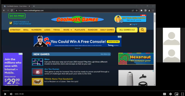
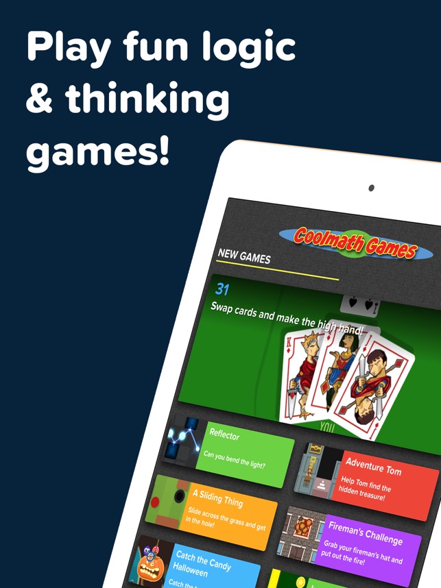
Cool Math Games is a website that serves the purpose of playing fun games that are based around the player learning different principles of math. There are various options to choose from in both math subjects and types of games available. Some games are focused on addition, subtraction, multiplication, and division, while others are leaning towards fractions and decimals. The subjects become very expansive and it allows students to have a full range of either what they want to know about or what skills they need to touch up on.
There are two different types of goals with this website since they serve two purposes, ones for students and ones for instructors. In terms of the goals for students, they are to find games that help them learn more about math and understand different subjects while still having fun and keeping themselves entertained. For the instructors, they can use this website in many different fashions, whether it could be in place as a reward for students, something to do to occupy their time, or for outside class time such as homework which will allow students to have fun while being able to “study”.
Although Cool Math Games is a good way of helping students and instructors out in the learning aspect, there could be a few potential issues that could either prevent them from achieving their goals or will slow them down and become a slight inconvenience. There were three major issues found that spanned throughout the entire website, which involved Account Issues, Search Issues and overall User Experience Issues.
Role
UX Lead, Student, User Tester
A group of 4 students and I worked on this project together. The other students’ names were Ali, Jasser, Rachel and Julia.
Design Process
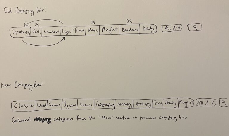
When starting my design process, I began drawing out the ideas I had in mind for the re-design, since this is more organized since I can put my thoughts on paper and see how I can arrange the items, which are shown below. From there, I made the recommended edits in Figma.
Search Bar:
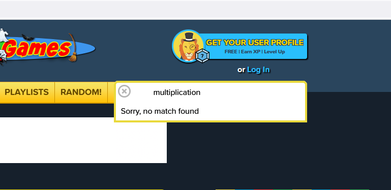
One way to find games is to use the Search Bar. However, you must know the exact name of the game you want to find. users are unable to search for keywords. This is a problem because it makes it more difficult for new users to find a game and even returning users if they do not remember the name. If it’s the user’s first attempt at using the search bar, they will ultimately fail and waste their time. They will then have to find another way to access the desired game.
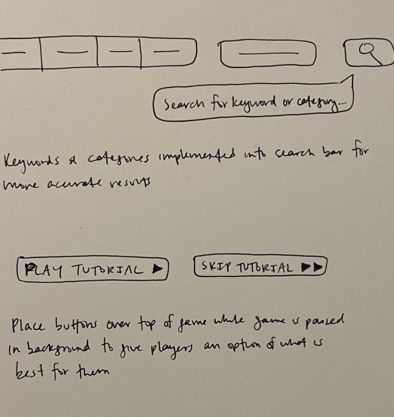
To help resolve this problem, the recommendation is to change the search bar to allow for a keyword or topic search. This would let users find games containing specific needs and making it easier to navigate different topics.

The change allowed for keywords to be pulled from specific categories. For example, the keyword “Addition” would bring up addition games, “Multiplication” would bring up multiplication games, etc. Keywords would also have to be added to the game descriptions so they can be found within the search engine. Also, the search bar would cover the game categories, so an easy fix was to put the search bar below the game categories to prevent it from being in the way.
Categories:

The most navigable way to find games in specific categories is to use the menu bar. This bar contains strategy, skill, number, logic, and more. The categories are extremely vague and fail to elaborate on the specifics of each category. For example, games are categorized as skill, but skill is not defined anywhere and could have numerous meanings. Users are also forced to go through multiple steps to find the specific category they need. This is a problem because it makes it difficult and time consuming to find a game.
To help resolve this issue, the recommendation is to organize the categories in a more specific and detailed manner.

I gathered categories located within the “More” section and placed them within the category bar. I altered the categories to put more specific ones on display. A couple categories were vague or redundant such as “Strategy” and “Logic”, which could be considered the same things. The re-design eliminated that issue, and also created a wider variety to give the user options to pick from.
Tutorials:
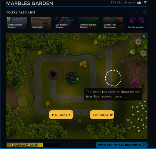
Tutorials are an important part of this website since it is aimed towards children who many not be able to figure out the games otherwise. Some games do not provide a tutorial at all, while others only have written instructions under the screen that people may not see, or the children may not be able to fully understand the directions. In other case, returning players may already understand how to play the game and the tutorial only gets in their way. This is a problem because users either do not understand the rules of the game or are forced to repeats tutorials.
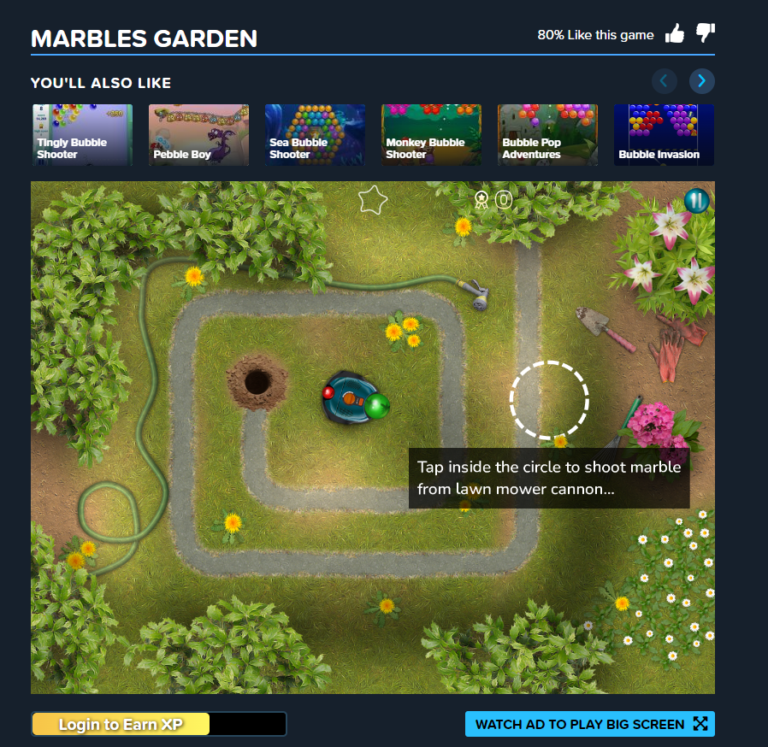
To help resolve this issue, the recommendation is to keep the consistency with tutorials and have ‘easy to understand’ instructions for every game. There should also be a ‘skip tutorial’ option for more experienced players.
Solution
The overall testing goal is to see what age group could potentially benefit from this website the most from a learning perspective, as well as see which games are accessible to players depending on what platform they are using (iOS or Windows). We will also learn how satisfied educators are with this product and identify errors that can be fixed to improve user experience.
User Test
Testing would be to assess the usability of Cool Math Games website. The goal would be to use the website as it exists now, which has been updated quite a bit since the people in this group were in the age group that frequented the site. We will be looking at the range of accessibility and the ways in which the website is actually usable to all people (or children) in order to develop their skills. We want to see if there are any barriers that would prohibit any specific group of children from being able to use the website and learn, by looking through the eyes of an educator.
The users would be tested remotely, and tests are between 30-60 minutes long.
The test was conducted through asking the users a series of questions to complete basic tasks on the website as instructed. As the tasks were completed, they were to announce what they were doing and to explain the difficulty of each task, whether it was easy or hard.
Here’s an example of the questions asked as well as the test below:
Results and Takeaway
Cool Math Games is a phenomenal resource for both students and teachers to utilize for intellect and concept growth in any math subject. The website doesn’t get updated too often since it has a simple formula to it. The solutions that were the most reasonable were already mentioned earlier in the case study, but would really benefit the user looking to utilize the properties of the website. It would also be easier for the web developers as well to have more sections of the website organized to make for a more cohesive experience for everyone. The next steps for this project would be to implement official redesigns of the website, after outlining what needs to be altered. Finding different solutions to fixing the website is something that could benefit all parties moving forward, and making product experiences easier for users is something that I find passion in.
